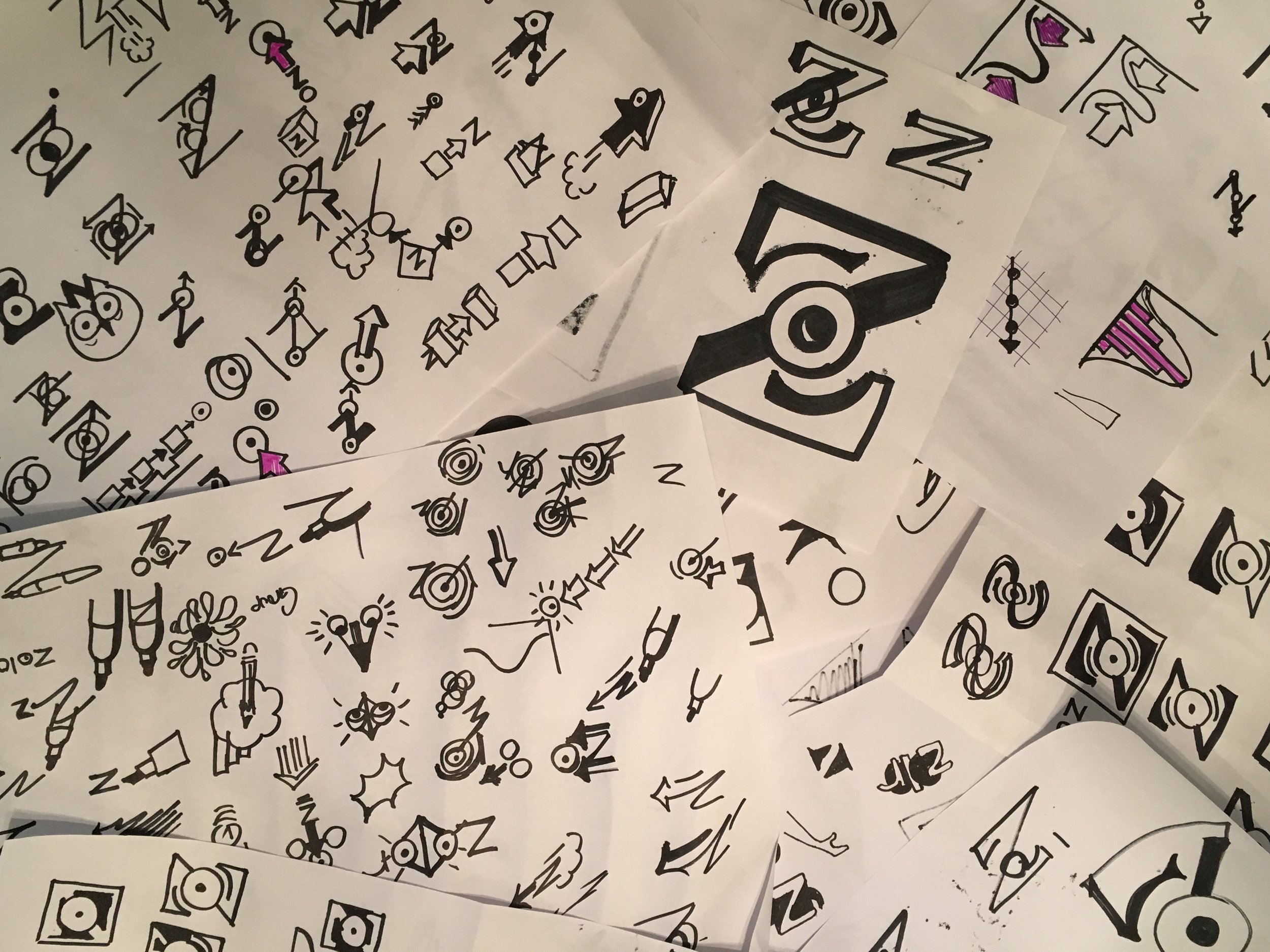
The Zolor Name and Logo
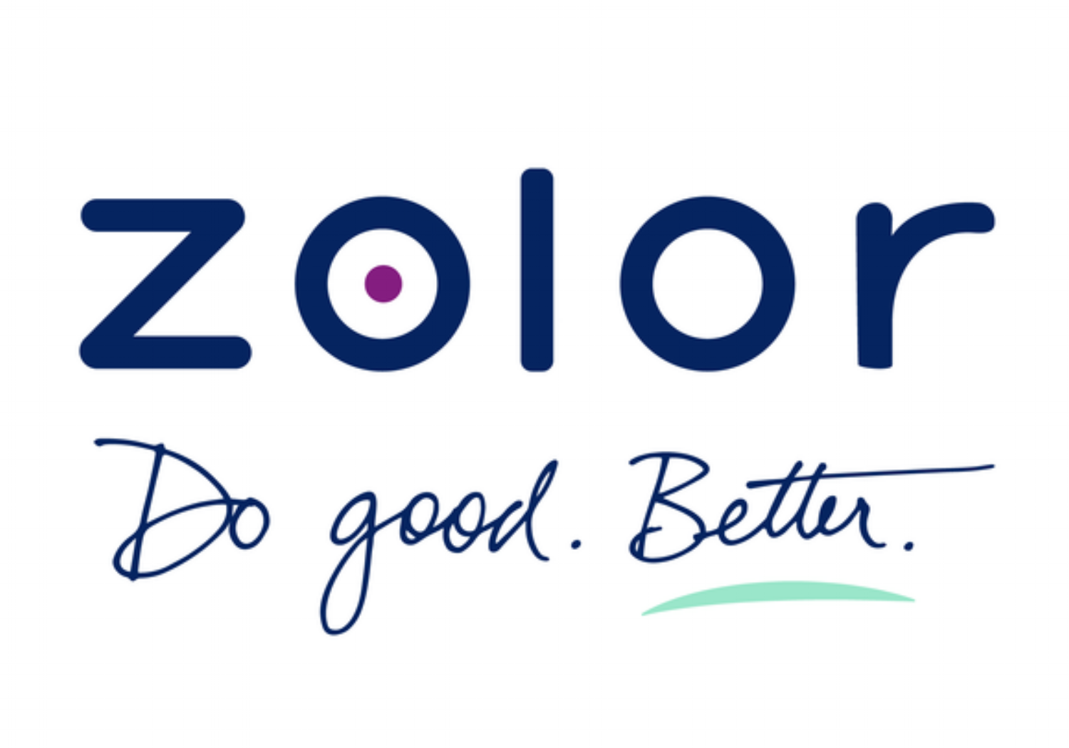
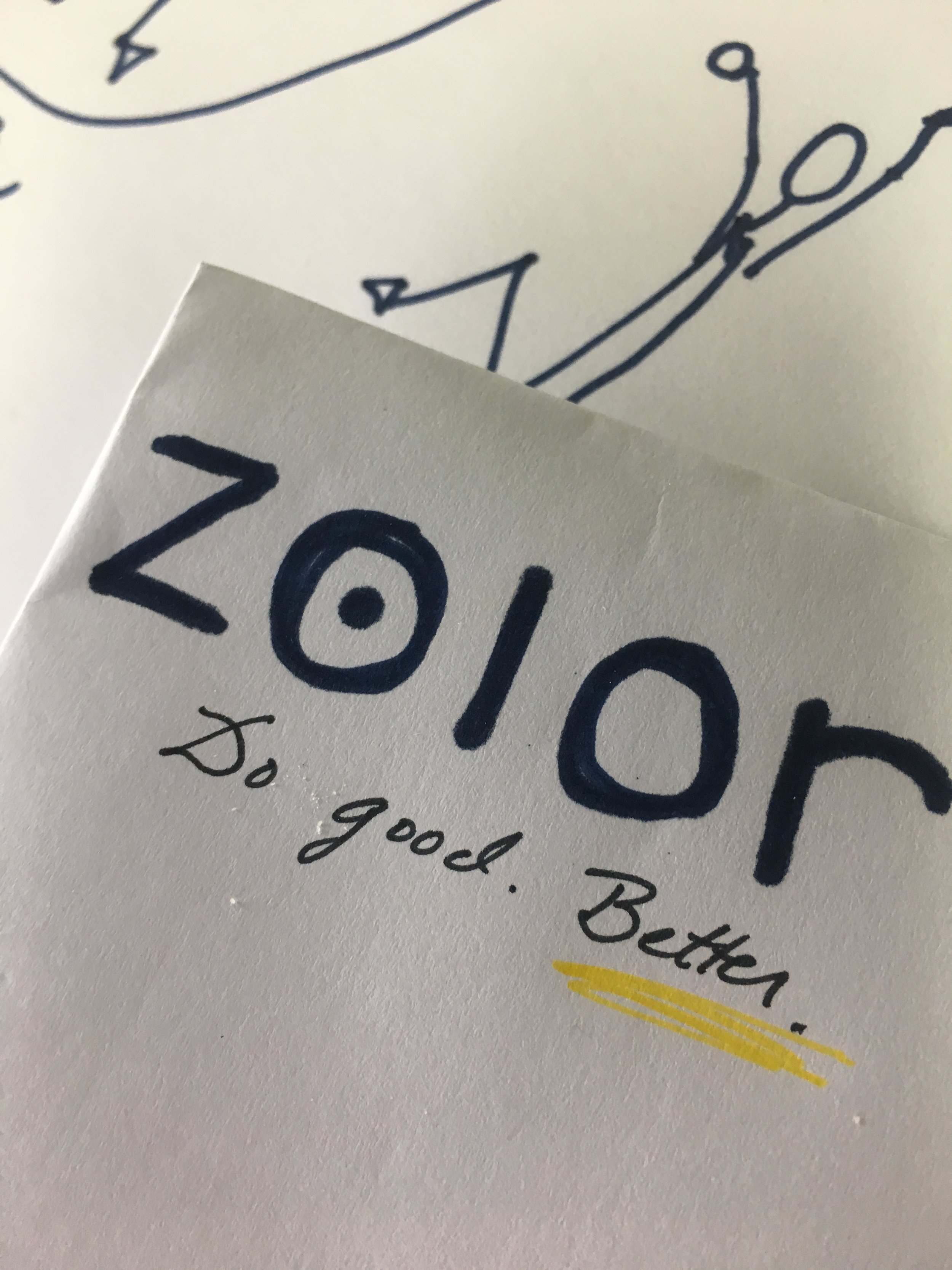
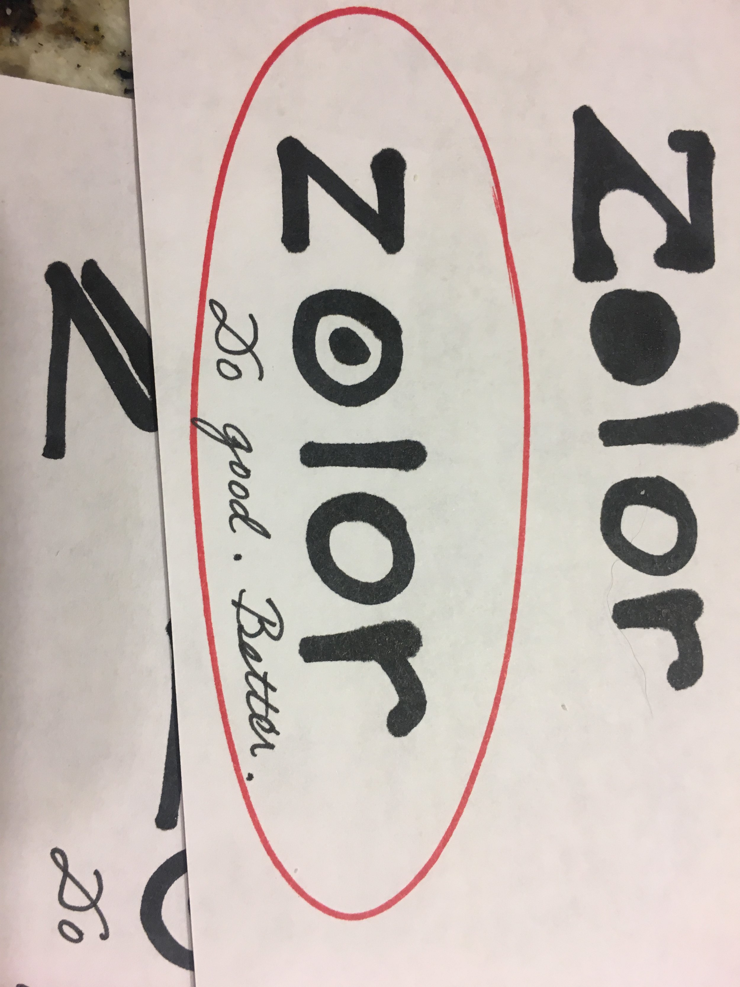
Zolor is a word created from the founder's name, "Zone," and the word "color."
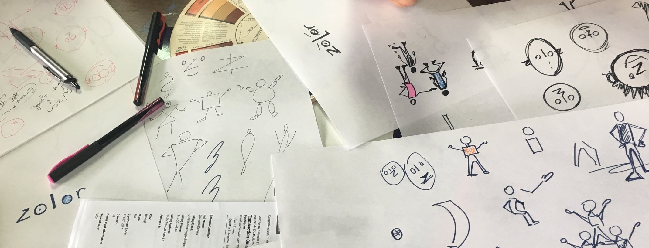
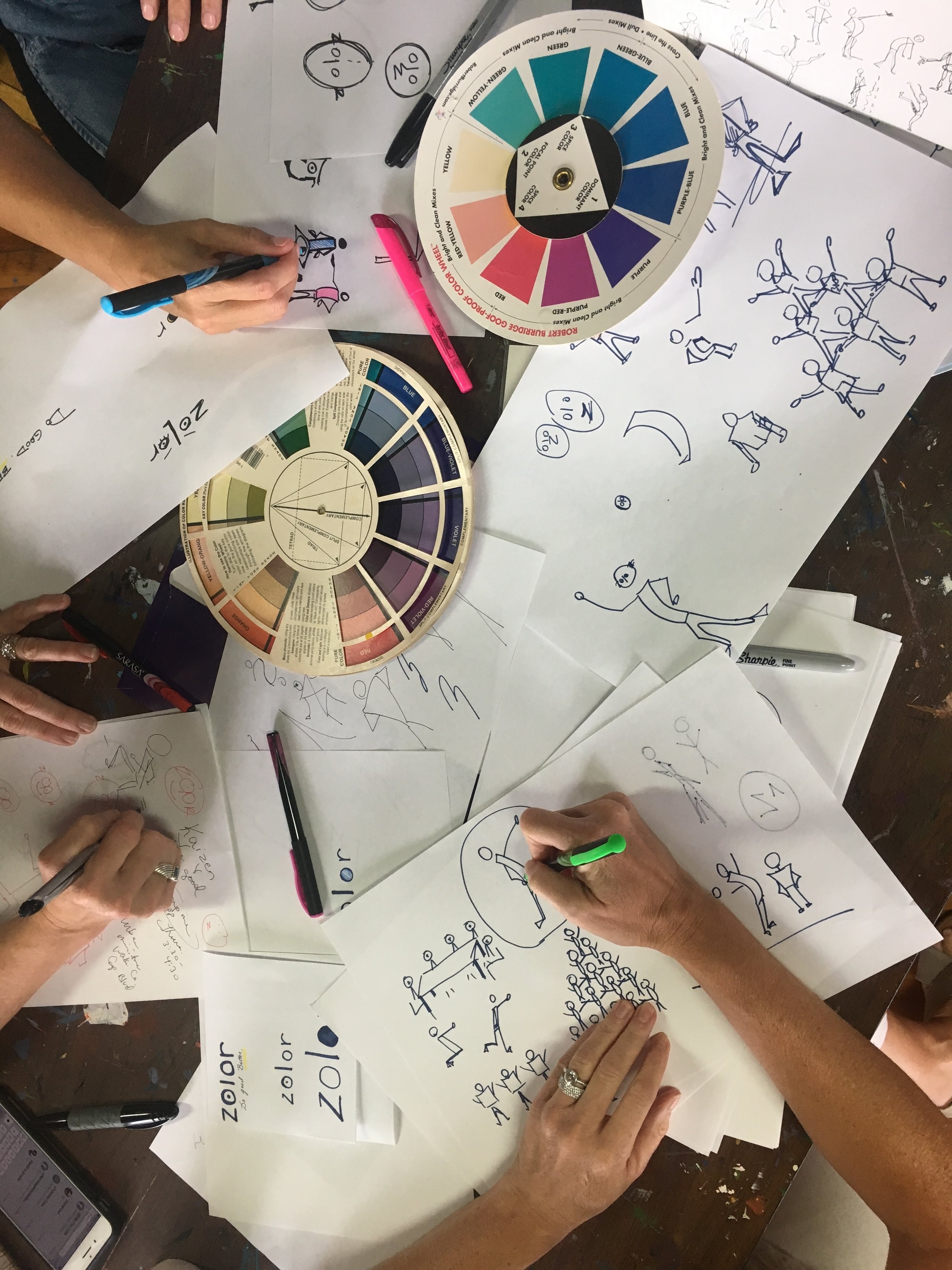
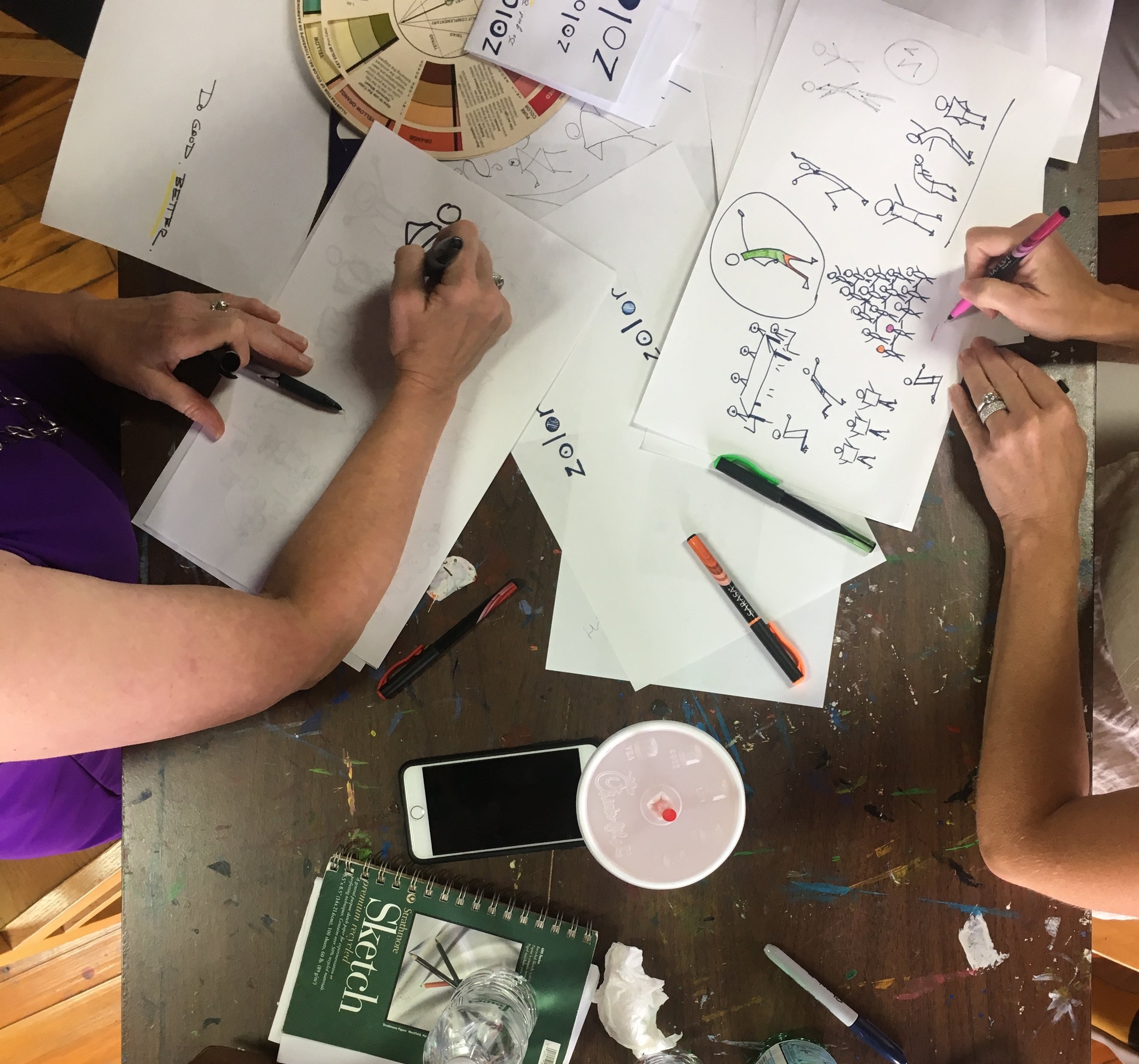
Why the dot? The letters of the word "Zolor" represent the five basic shapes, used to draw anything in the world: an angle line, a circle, a straight line, a curved line, and a dot.
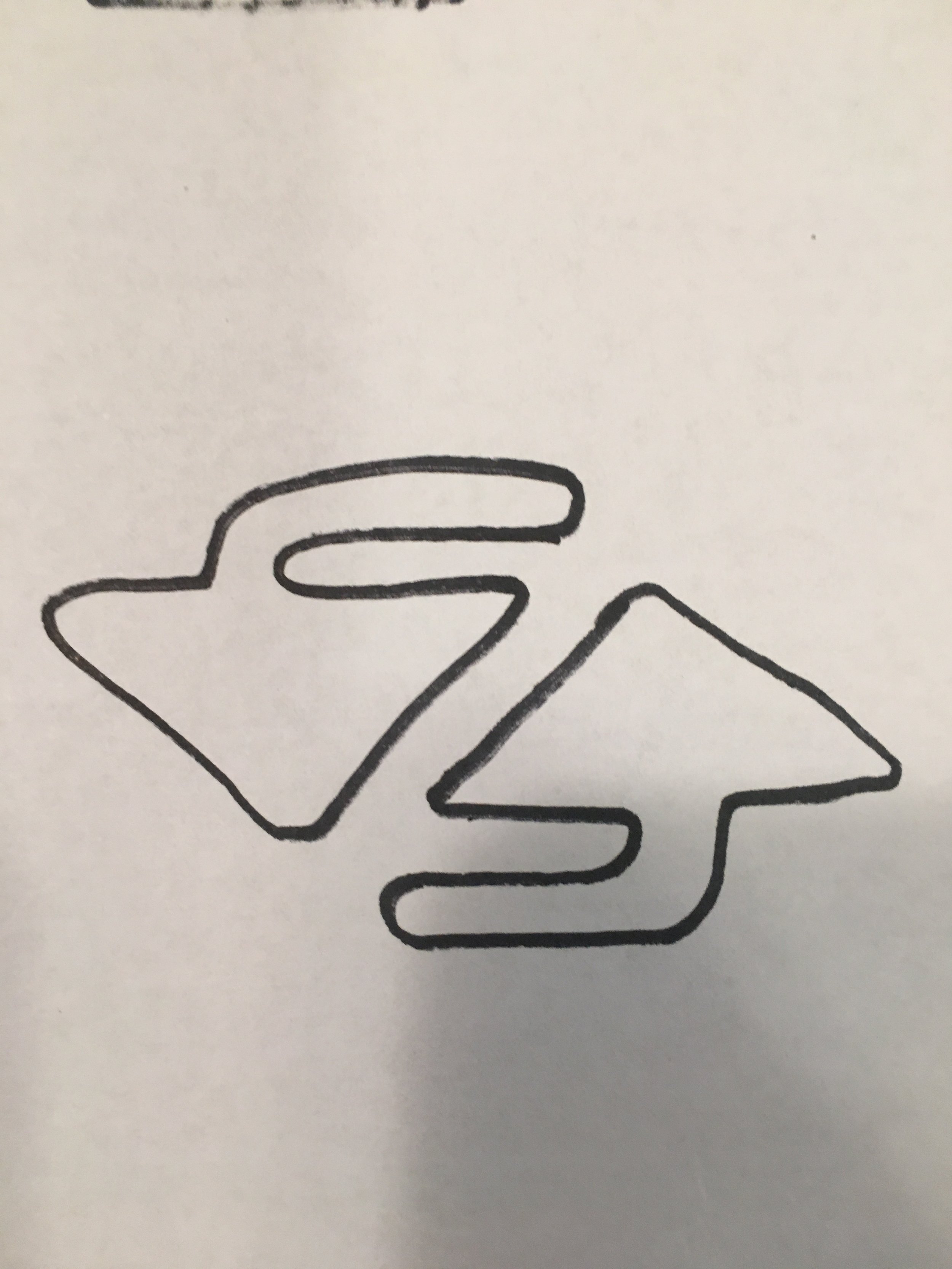
The logo signifies three important attributes of Zolor's message. The arrows move around in a path of continuous flow and continuous process improvement. The negative space shows the letter "Z," reminding us to look at things differently when approaching solutions. And finally, it was not until we thought "outside the box" of the rectangular "Z" shape that the logo design became possible, as the corners of the arrows broke into space that had previously been "off limits."
The logo was created with help from Zolor Group members, Lisa Mathis, Charlene Vermeulen, Christine Dennis and Shelley Kelly, and vectorized and animated by Luke Barker, Graphic Artist.
